Writing semantic HTML even when you don't know any better: progress vs meter
✍️
There are something like 110 unique tags in HTML5. Not exactly the easiest list to memorize, am I right? (Even for me, and I'm the kind of person whose desktop wallpaper shows a periodic table of HTML5 elements.)
So, how can you figure out which semantic element to use when you don't even know what's available to you? Let's take a look at a real-world example.
Define the component requirements
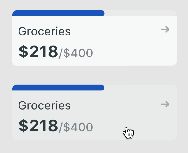
The design team at Netlify recently passed off a new Figma component for implementation in React. Looks pretty straightforward to me!

I started by making a quick list of the requirements. The component should have:
- the ability to act like a link if an
hrefis passed - a status bar to indicate current usage, which looked a lot like the
<progress>element to me - a numeric
valueandmaxlimit - the ability to handle different units (such as money, file size, etc.)
- styles that match the mockup, including hover and focus states
Ask: "Does my markup make sense in plain English?"
Knowing the requirements can help us translate the component into code.
Narrowing in on the link and status bar reqs, I wrote three lines of markup:
<a href="http://leslie.dev">
	<progress value="218" max="400">54%</progress>
</a>Why did I use <progress>? First, because I knew it existed, and second, because the default styles for <progress> look almost exactly like the design mockup I was given.
But when I write new HTML, I try to ask myself: "Does this markup make sense in plain English?" This is, after all, the essence of what the word semantic means: the "correct interpretation of the meaning of a word" (source: dictionary.com). In most cases, we should be able to "translate" our markup into an intelligible sentence.
So: "$218 used is progress toward a $400 budget."
Not quite right, huh? It would probably make more sense to call this "money usage," not "money progress."
Rewording markup in plain English can help make semantic discrepancies more obvious. Checking the MDN docs also provides some clarity:
The HTML
<progress>element displays an indicator showing the completion progress of a task
We're definitely not showing the completion progress of a task here. Case closed! We shouldn't use <progress> for this component.
Follow the docs
So, what element should we use instead?
Lucky for us, MDN is great at giving hints. If we keep reading the docs about <progress>, we'll come across a note under the "Attributes" heading that mentions the related <meter> element:
The HTML
<meter>element represents either a scalar value within a known range or a fractional value
To steal a catchphrase from former Netlify designer Rafa Conde: 🛎️ Ding!
We want to communicate that $218 was used in relation to a maximum budget of $400. This is the element we want!
Keep learning: <meter> in context
If it seems like we had to do a lot of work in order to make a one-word change in the final markup, you wouldn't be wrong.
<a href="http://leslie.dev">
	<meter value="218" max="400">$218/$400</meter>
</a>So why put all this effort in?
Well, besides the obvious accessibility wins, using the proper semantic element can give us more functionality for free.
In this case, <meter> has some special attributes baked in that <progress> does not. Along with min and max, <meter> also supports low , high, and optimum. These attributes let us specify the bounds of the measured range, and we can also use them to hook into pseudo classes for custom styling.
This means we can control the color of our status bar based on the value!
So now we can style the bar to be green when it's in the lower bound, blue in the optimum or expected range, and yellow as we near the limit of our budget.
<a href="http://leslie.dev">
	<meter value="370" max="400" high="300" optimum="200">$370/$400</meter>
</a>CSS Tricks offers more tips for styling the <meter> element.
If you're interested in how I styled this particular component to match the mockup, let me know on Twitter and maybe I'll draft a follow-up (spoiler: applying selective rounded corners to the different states of <meter> is a trip!).
TLDR: Semantics matter
When writing new markup:
- Ask: "Does my markup make sense in plain English?" Rewording markup in plain English can help make semantic discrepancies more obvious.
- Read the MDN docs to confirm your usage
- Leverage baked-in functionality for free